Listen to the article
In a recent social media post that has sparked debate among data analysts, the White House presented a chart highlighting U.S. steel production that appears to show a dramatic increase from 2024 to 2025. However, statistical experts have raised concerns about the visualization’s accuracy and the message it conveys.
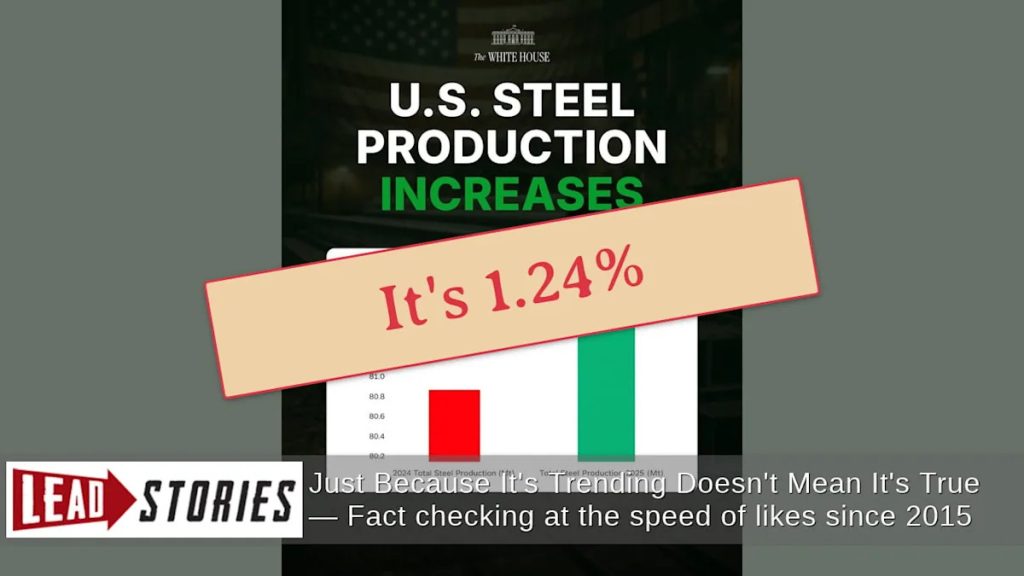
The post, shared on January 30 via the official White House X (formerly Twitter) account, proclaimed “American steel is BACK” alongside a chart titled “U.S. STEEL PRODUCTION INCREASES.” The graphic displayed two bars representing steel production in 2024 and 2025, with the 2025 bar appearing approximately twice the size of the 2024 bar.
This visual representation suggests a massive increase in production, potentially leading viewers to infer a doubling of U.S. steel output. However, the actual figures tell a different story. According to the data presented, steel production is projected to increase from 80.8 million tons in 2024 to 81.8 million tons in 2025—a modest 1.24% increase.
The disparity between the visual impression and the actual data stems from a statistical technique known as a “truncated axis.” Instead of starting the vertical axis at zero, the White House chart begins at 80.2 million tons. This design choice significantly amplifies the visual difference between the two values.
Michael Correll, an expert in data visualization, has extensively documented this phenomenon in his research paper, “Truncating the Y-Axis: Threat or Menace?” Such truncation can dramatically alter perception of data trends and is often considered problematic in statistical circles when not clearly noted or when used in ways that might mislead viewers.
For proper context, examining U.S. steel production over the past decade reveals a more nuanced picture. Data from the U.S. Geological Survey shows that while there is indeed a projected uptick from 2024 to 2025, this increase appears relatively minor when viewed against historical fluctuations.
The steel industry has experienced significant volatility in recent years. During the pandemic recession in 2020, production dropped substantially as demand plummeted. The following year saw a sharp rebound as economic activity resumed. These major shifts dwarf the projected 1.24% increase highlighted in the White House’s post.
The U.S. steel industry remains a critical sector of the American economy and a frequent focus of political discourse. Steel production is often viewed as a barometer of industrial health and manufacturing capability, which explains why even modest increases might be highlighted by administration officials.
However, statistical transparency is equally important in public communications. Data visualization experts generally recommend that bar charts begin at zero to avoid misrepresenting proportional differences. When axes are truncated, clear indications of this choice help viewers understand the actual magnitude of changes being displayed.
This incident highlights the ongoing tension between effective communication of positive economic indicators and the statistical integrity expected in government communications. While the White House’s message about increased steel production is factually accurate, the presentation method has raised questions about whether the visualization appropriately reflects the scale of improvement.
As debates around economic policy and industrial growth continue, the accuracy of data representation remains crucial for informed public discourse. The steel industry’s modest projected growth serves as both a positive economic indicator and a reminder of the importance of contextualizing data within broader historical trends.
Fact Checker
Verify the accuracy of this article using The Disinformation Commission analysis and real-time sources.


8 Comments
It’s concerning to see such a clear case of misrepresentation, even if unintentional. The public deserves accurate information to evaluate policies and economic trends. Improved data literacy and transparency should be priorities.
This is a good reminder that we must scrutinize data and visualizations, especially from official sources. Subtle manipulation can obscure important nuances. Fact-checking and critical analysis are essential for informed decision-making.
Well said. Responsible data presentation should be a core principle for government communications. Maintaining public trust requires honesty and transparency, even for positive developments.
Interesting analysis. Misleading data visualization can certainly skew public perception. It’s important for government agencies to present information transparently and accurately, even on positive trends.
Agreed. While it’s good to highlight progress, the visualization should faithfully reflect the underlying data. Transparency builds trust in policymaking.
While the overall trend is positive, the misleading visualization undermines the credibility of the message. Policymakers should prioritize clear, honest communication to build public confidence. Careful data analysis is key.
This is a common pitfall – using truncated axes to exaggerate changes. Responsible data presentation is crucial, especially for influential government communications. Fact-checking and statistical rigor are essential.
Absolutely. Misleading visuals can distort the public’s understanding of important issues. I hope the White House learns from this and commits to more ethical data visualization going forward.