Listen to the article
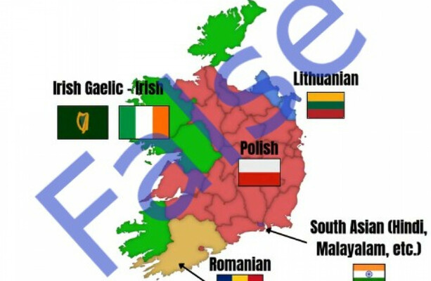
A colorful map purporting to reveal the second most commonly spoken languages across Irish counties has been making the rounds on social media platforms, capturing widespread attention but raising questions about its accuracy.
The image, which has been shared extensively on X (formerly Twitter), Facebook, and Reddit, displays a rainbow of colors across Ireland’s counties, with each hue supposedly representing different languages including Polish, Lithuanian, Romanian, French, and Chinese.
According to the viral graphic, Polish ranks as the second most common language in 17 counties, while Lithuanian holds that position in four counties, predominantly in border regions. The map suggests Romanian is the runner-up language in Dublin, with French claiming second place in Galway, and Chinese leading non-English languages in Cork.
Despite its eye-catching presentation, the map lacks any citation of official data sources, immediately raising red flags about its reliability. Upon closer examination, the information appears to contradict Ireland’s official census statistics.
The Central Statistics Office (CSO), which conducts Ireland’s national census, provides detailed demographic data including languages spoken throughout the country. The most recent complete language statistics come from the 2016 Census, with preliminary data from the 2022 Census released earlier this year.
According to the 2016 figures, Polish indeed emerged as the most commonly spoken language after English and Irish in many counties, aligning with the map’s general representation. This reflects the significant Polish migration to Ireland following Poland’s EU accession in 2004, which has created vibrant Polish communities across the country.
However, the map’s county-by-county breakdown contains several discrepancies when compared with official census data. For instance, the graphic shows Romanian as Dublin’s second most common language after English, yet census figures indicate Polish speakers significantly outnumbered Romanian speakers in the capital as of 2016.
Similarly, the map’s representation of Chinese as Cork’s second language does not align with census data, which placed Polish well ahead of Chinese languages in Ireland’s second-largest city and county.
The demographic landscape of Ireland has evolved substantially since the early 2000s. The Celtic Tiger economic boom of 1995-2007 transformed Ireland from a country of net emigration to one attracting substantial immigration, particularly from Eastern European EU member states and beyond. This demographic shift has created more linguistically diverse communities across the island.
Census data reveals that approximately 612,000 Irish residents spoke a language other than English or Irish at home in 2016, representing about 13% of the population. Polish speakers constituted the largest group among these, with approximately 135,000 people, followed by French, Romanian, Lithuanian, and Spanish speakers.
The 2022 Census data, while not yet fully released for language statistics, is expected to show further changes in Ireland’s linguistic profile, possibly reflecting newer migration patterns including those resulting from the Ukrainian refugee crisis.
Dr. Mary Murphy, a sociologist at University College Dublin specializing in migration patterns, notes that such maps, while engaging on social media, often oversimplify complex demographic information. “Population distribution across Ireland isn’t uniform, and language use varies significantly between urban centers and rural communities. These nuances are typically lost in simplified visual representations,” she explained.
The viral map also fails to address the methodological question of how “second-most spoken” is defined. Census data typically distinguishes between languages spoken at home, proficiency levels, and daily usage patterns – distinctions lost in the simplified graphic.
While the map does capture some general patterns of language distribution in Ireland, its specific county-by-county claims do not consistently align with official statistics. As with many viral infographics, it appears to prioritize visual appeal and shareable content over rigorous accuracy.
For those seeking reliable information on language distribution in Ireland, the Central Statistics Office remains the authoritative source, providing detailed breakdowns based on systematic nationwide surveys rather than unofficial compilations of uncertain origin.
Fact Checker
Verify the accuracy of this article using The Disinformation Commission analysis and real-time sources.


8 Comments
Interesting to see the claims made by this viral map. I’m curious to learn more about the actual linguistic diversity across Ireland’s counties based on the national census. Fact-checking viral content is an important service.
Fascinating to see what the viral map claims about second languages in Irish counties. I’d be curious to see how it compares to official census data from the CSO. Seems important to verify claims like these before they spread too far.
Agreed, relying on unverified sources can lead to the spread of misinformation. It’s good that this post is fact-checking the claims to provide accurate information.
This is a timely fact-check given the spread of the viral map. It’s good to see the post digging into the reliability of the claims and comparing them to official census data. Transparency around sources is crucial for this type of information.
Agreed, fact-checking viral content is so important to counter the spread of potential misinformation. Looking forward to seeing the full analysis in this case.
The diversity of languages spoken across Ireland is really interesting. While the viral map is eye-catching, it’s concerning that it doesn’t cite official data sources. I hope the fact-check can shed more light on the real linguistic landscape.
Absolutely, transparency around data sources is crucial for claims like these. Looking forward to seeing the analysis against the national census figures.
As someone interested in demographics and language trends, I’m glad to see this fact-check. Verifying the accuracy of viral maps and claims is important, especially when they involve sensitive topics like immigration and diversity.